By Celeste Hawkins
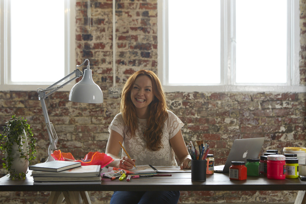
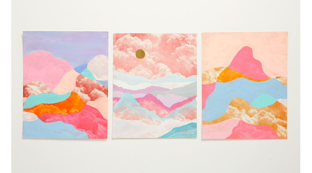
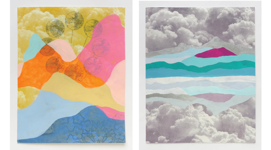
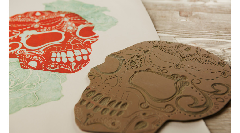
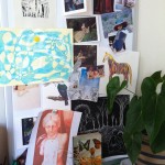
Looking around Jessica Lyons’ apartment, you can see where she draws on inspiration for her diverse artworks. There is a strong understanding of the design elements evident against the interior red brick of the old converted factory. One of her large skull prints on the wall was created in response to trips to South America and India. Brightly coloured geometric patterns are everywhere, which seem to take prevalence in many of her works. Jessica tells me that her mergence of styles reflects her process of building a bridge between design and art. Currently studying fine art part time at Melbourne’s RMIT, she is thoroughly enjoying the process of expressing herself through a variety of media. It’s this combination that is propelling her forward “The two practices are always influencing one another. My design experience comes in handy when an art brief requires reason and rationale”, she says.
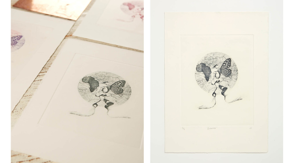
Photographic etching from a copper plate is a technique Jess has fallen in love with for its scope and layers involved. Perhaps because it allows her to partly create the image on a computer. It’s then exposed onto a copper plate coated in photographic film and then etched in ferric acid. In the end, the image has textures that you don’t really get from just using Photoshop. Jess explains:
I love using a combination of digital and hand applied techniques, which photo etching lends itself to. You get really interesting and varied results, and the plate embosses the paper which is beautiful. I love a tactile finish. I like making each print unique, adding things afterwards or using different layering combinations. It becomes a work of it’s own rather than part of an edition.
Having worked as a Graphic Designer for almost 10 years, I asked Jess what took her back to study:
I started out as a packaging designer, although after a while realised graphic design isn’t always that creative! I knew I had more creative potential, and that I wouldn’t dig it up answering client briefs. That’s what took me back to school. I still don’t have a fixed outcome on where my career will go-but I love all the discovering that happens now – it’s exciting. In graphic design you’re often being pushed back to the ‘brand guidelines’. At uni they’re more like: ‘tear it in half and take it somewhere totally new’. The experimental & playful side is really fun. Plus you get the chance to experiment with different mediums and techniques. I never thought I’d enjoy doing sculpture, but it’s fun! It’s always getting you to think about things from a new perspective; those skills have definitely benefitted my design work.
Has the design work informed your current creative path?
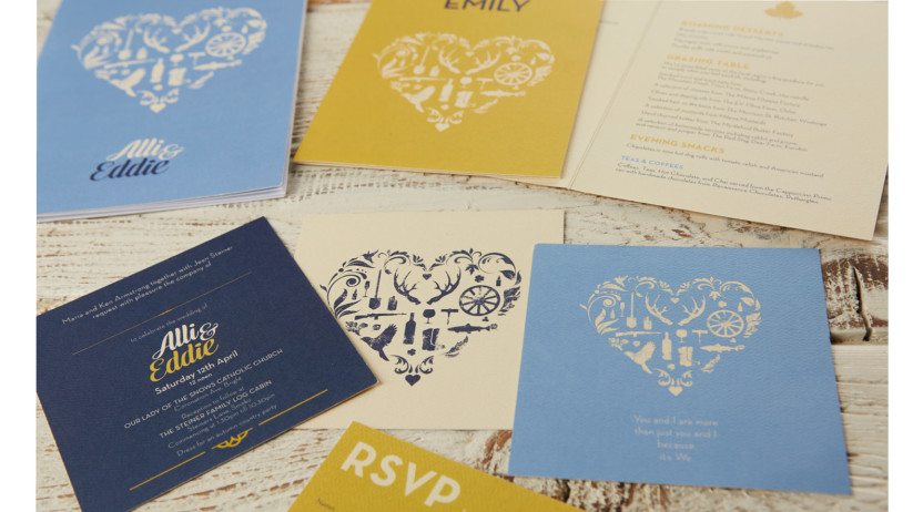
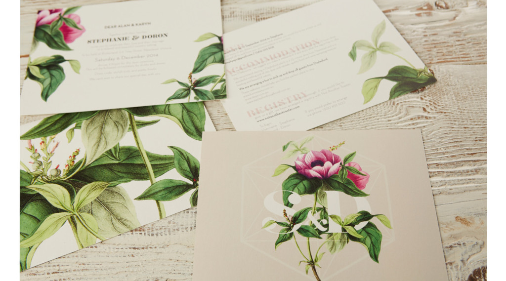
Of course, and I’m searching out jobs that combine both skills. I love creating wedding invitations, because people often want something unique – bright and colourful, gold foil or hand painted.
What are some new projects you’re finding yourself going into?
Really interesting ones! I learnt how to make Stop Motion animation at school and have made a few self-directed clips. I actually popped one on social media and a new client approached me to create one for their brand. That was a really different and enjoyable process. Creating storyboards of the concepts, engaging a professional photographer and a model, then editing, I really got into it. The stop motion was around 2000 photographs strung together into a 60 second clip. What you end up with is the magic effect of things moving. It was pretty great to paid for something like that!
Her newest project is much larger than anything she’s ever done before. Jess has been working on an urban installation artwork for the start of a new development to be built in Brunswick East, on Glenlyon Road. The design itself will be about 8 metres tall and her design made into a precast that concrete will be poured into.
How did you come up with the design?
Its largely pattern based and symbolically draws on the history of the area. The shape of Merri Creek is part of the design as it’s a distinctive feature of the area. The patterns and shapes represent multiculturalism and the community coming together. I felt keeping it abstract and minimal would help the piece be more timeless. It’s definitely the largest scale project I’ve done.
What are your plans for future projects?
I’ll keep seeking out new and interesting projects with an artistic edge with that merge of art and design. And I definitely want to seek out more urban installations! And always find new and interesting ways of combining art & design.
Jessica’s artwork is available via her online store: jessicalyons.com.au
And follow her here to see what she’s up to on Instagram: @jessy_lyons
Invitation designed by Jessica Lyons
